Garmin Data Field Design Challenge
Background
The goal of this design challenge is to practice Design Thinking (Empathize, Define, Ideate, Prototype, Test) and summarize the challenge in a structured way.
The Challenge
Design a watch interface for MAF training.
My Role
Research, interface design.
Company Overview
Garmin produces wearable fitness tracking devices aimed at activities such as walking, running, cycling, and swimming. These devices, typically watches, feature built-in heart rate monitoring or they can sync with compatible heart rate monitor straps. The wearer can customize the display by downloading apps, widgets, data fields, and watch faces.
Training Overview
A popular method for cardiovascular exercise is heart rate training. This uses your heart rate, measured in beats per minute (bpm), as a guide for training intensity. Intensity is broken down into “zones” calculated as percentages of your maximum heart rate (MHR). What zone an athlete aims to exercise in is based on their personal or prescribed (usually by a coach) zone. Each zone serves a purpose and can be categorized as aerobic or anaerobic conditioning. The zones are typically defined as follows:
- Zone 1: Very light, 50 percent to 60 percent of MHR
- Zone 2: Light, 60 percent to 70 percent of MHR
- Zone 3: Moderate, 70 percent to 80 percent of MHR
- Zone 4: Hard, 80 percent to 90 percent of MHR
- Zone 5: Very hard, 90 percent to 100 percent of MHR
Garmin devices calculate these zones for the user and provide live biofeedback during activities by displaying information about what zone the athlete is in. The device will also provide post-activity summaries.
There are different methods of heart rate training. This design challenge will focus on MAF training. MAF stands for Maximum Aerobic Function which aims to help athletes build a great aerobic base and falls within Zone 2. Although there are many training metrics that can customize to your liking, there are no easy, ready-to-go data fields specific to MAF low heart rate training, which is different than standard HR zones.
Understanding your users
Research
I started my research by reading through The MAF Method site and reading “THE MAF Method” eBook by Dr. Philip Maffetone. Then I found MAF Method social media posts, blogs, and websites to gain insight on the frustrations they were experiencing and what their wants and needs were. I quickly identified the main issues people had with MAF training:
- Miscalculating max HR (known as the “denial phase” or characterized by those who feel “the formula doesn’t apply to me”)
- Consistently going over max, especially during first weeks/months of training
- Slowing down a lot to stay below MAF threshold level (low confidence – Am I doing this right?)
- Within minutes of starting, HR shoots up causing you to have to slow down even more
- Setting device to alert when max has been exceeded often doesn’t trigger until already a few beats over. According to Dr. Maffetone, going over MAF by even 2-3 beats can trigger mildly anaerobic response which is something that is supposed to be totally avoided during MAF training.
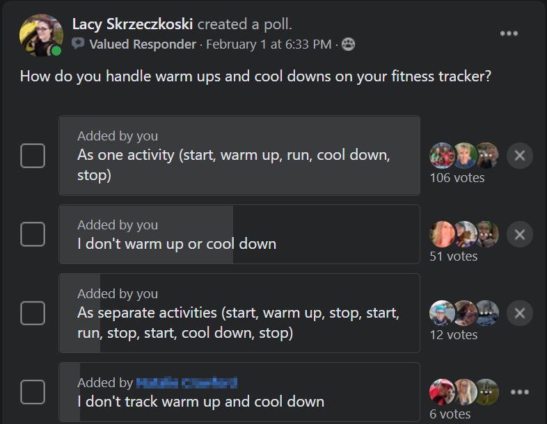
Because MAF training relies on a proper warm-up and cool down, I wanted to know how people typically track these with their device. I polled a Trail and Ultra Running group and asked how do you handle warm-ups and cool downs on your fitness tracker?
- Option 1: As one activity (start, warm-up, run, cool down, stop)
- Option 2: As separate activities (start, warm-up, stop, start, run, stop, start, cool down, stop)
- Option 3: I don’t warm-up or cool down
- Option 4: I don’t track warm-up and cool down
Define the problem
With all this information at hand, I crafted my problem statement.
Athletes are struggling to use Garmin heart rate monitoring devices for MAF training because standard heart rate zones are incompatible. Connect IQ, which has thousands of apps, has nothing on the market for MAF or low heart rate training. With the popularity of MAF training, a targeted data field will help athletes better execute MAF training and will easily be chosen over any other heart rate training data field currently on the market.
Then I got to work identifying my users.
- I am an athlete who follows the MAF Method to build my aerobic base and increase endurance. It is important I know that I am “in the zone” so I can ensure I am following my training plan correctly. I regularly use fitness tracking tools, such as heart rate monitoring, to provide biofeedback during training. My preferred device is a Garmin fitness watch and I like that I can pick and choose different screens to download onto my device but searches for “MAF” or “low heart rate training” do not show useful options. Options I do see have different zones and I am confused with how these can be used for MAF.
- I am new to wearable devices and am easily overwhelmed with so many customization options. I need an easy to set screen that makes it simple to use the Maffetone Method.
- I recently converted to low heart rate training. I am familiar with data fields, but the available options seem too complicated and focus on Z3-Z5 training. I need a screen relevant to only Z2 training.
- I am a self-proclaimed “data junkie” and obsessed with my fitness watch. I often post on social media about “my gains” and even share screenshots of my device during training. I need Insta-worth displays that I can share with my followers.
- I have low/sensitive vision and find most of my device’s screens hard to read, especially while I am active. The text is too small, cluttered, and blends in with the rest of the screen. I need to choose my own color and font size so I can see what is on my screen without strain.
- I use my device in a lot of settings (sunny, nighttime, rainy) and in all temperatures. My device must touch my skin to detect a heartbeat and my coat often covers it up. I need a screen-free experience with non-visual alerts whenever I fall out of my personalized zone.
Early Ideation
Challenge Assumptions
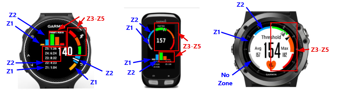
Before I worked on sketches for the design solution, I wanted to get a grasp of what wasn’t working with what was already on the market. The data fields offered too much of the wrong information and not enough of the right information. It is not useful to see a rolling HR histogram, know what your max or average HR has been during that activity, or time spent in Z3-Z5. Watches have a very small display screen, and all this additional information makes for a crammed presentation.
Athletes instead need the following:
- An accurate MAF max
- Users frequently select the wrong category decreasing the effectiveness of training.
- Their MAF range (MAF max to MAF max minus 10 beats)
- Users, especially beginners, struggle to maintain awareness where they are in the range.
- Alerts for nearing/entering/exiting the MAF range
- Users are frustrated that optional built-in alerts trigger after the threshold is exceeded. Even 2 to 3 beats over the MAF threshold can trigger an anaerobic response.
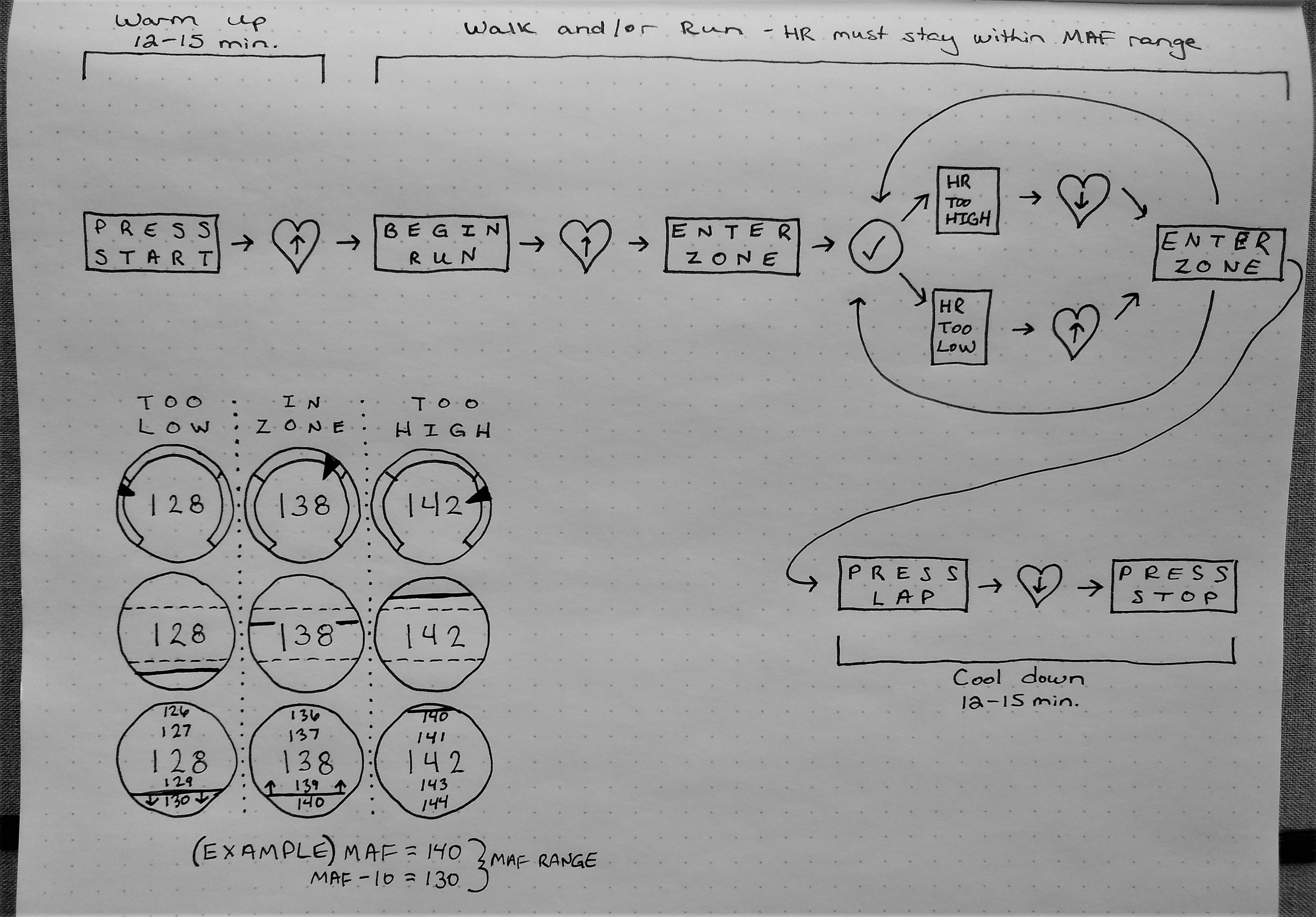
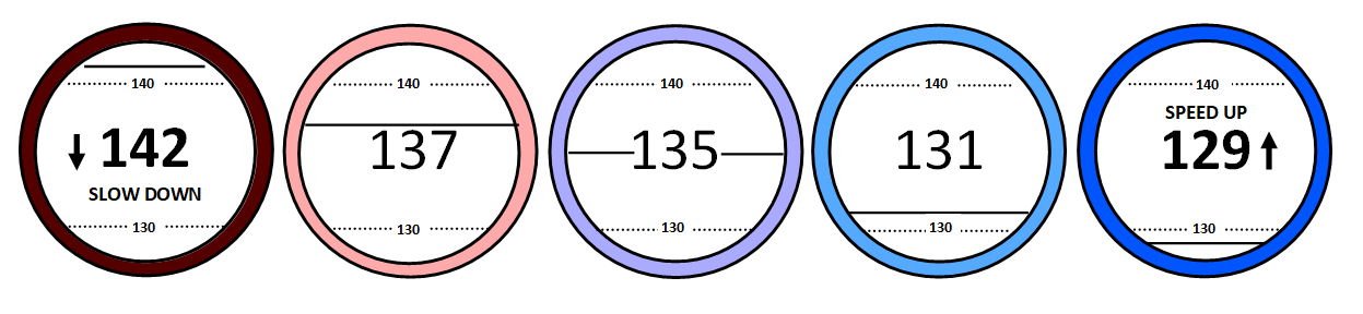
Initial Design
The main display of the data field would be a personalized MAF range. During the activity, a solid line will travel up and down the range providing biofeedback and coaching tips to "slow down" or "speed up" to keep you in the desired range.
Learning Experience and Next Steps
I started this project with a heart rate graph wondering how to get something like it on my watch, but I didn't know how to even begin. The Design Thinking Method help me start this project by providing a systematic approach to defining a problem, understanding users, and working towards a solution that has value.
I was surprised to learn design thinking isn't a sequential process. You can work through the stages in parallel and return to any stage iteratively to refine. I certainly felt like I was working in a circle at times, but each loop around I felt myself getting closer to the objective.
If I could carry on this project, I would want to ask a specific audience for focused feedback on the design, then analyze the results for actionable insights. I would use multi-choice questions to ask user's preferences. Questions would be designed to cut bias. For example, using "what do you think" versus "what do you like". When appropriate, questions would include options for "None" or "Other" with the option for participants to add their own response. I would also use scale format questions to gauge confidence and clarity of the design.
I would work on identifying priorities, possibly using MoSCoW prioritization. An example of prioritization for this project could look like the following.
- Must have
- Easy and accurate Z2 calculation
- Custom color options
- Custom alert options (i.e. sound, vibrate)
- Should have
- Customizable alerting (early vs. over)
- Use device input to reduce user double-entry (i.e. age)
- Could have
- Training status indicator since built-in one isn’t MAF compatible
- Cardiac drift (fatigue) alerting
- Won’t have
- Heart rate variability
- Rolling HR histogram
This is a product I truly believe is missing in the Garmin market. As much as I would love to bring it there, I have so many other projects I want to work such as writing articles, fulfilling a dream of becoming a speaker, and completing an information architecture challenge.
For now this project will sit on the back burner because the road to success is the power of prioritizing!